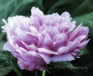
I love the range of applications available in editing my images. I don’t always use one; it depends on the look I’m trying to achieve, the audience I want to reach. Black and white is a timeless, classic look.
And there’s no denying that full color shots can be show-stoppers, but if an image is too saturated it doesn’t always print well–at least in my experience. I strive for a natural look and sometimes that means toning down the color a bit.
There's a third option–and I doubt I'm the first to think of it–that I refer to as "color wash." I take the saturation all the way down to black and white and then add just the tiniest bit of color back. It's a different approach, a softer look, and again, it depends on your audience. And personal choice. I like giving my viewers, and my clients, choices.
Which one speaks to you? I’d love to know. Comments always welcome.


